Logo Old MTV
Sample Logo Joker Community
Draw and Coloring Love a RocknRoll
Labels: drawing and coloring 0 comments
Posted by
Muhammad Nurwegiono (41099007)
at
5:00 PM
![]()
![]()
Sample Design Interrior in NIIT
Labels: design interrior 0 comments
Posted by
Muhammad Nurwegiono (41099007)
at
4:42 PM
![]()
![]()
Sample Image E-book
Labels: cover book 0 comments
Posted by
Muhammad Nurwegiono (41099007)
at
2:27 AM
![]()
![]()
Poster Burger Goe-Kilz
Labels: poster 0 comments
Posted by
Muhammad Nurwegiono (41099007)
at
2:18 AM
![]()
![]()
Free template constructor
Labels: template 0 comments
you can download .psd from sample template Free template constructor ,
please click here for download!!
Posted by
Andri Design
at
11:20 PM
![]()
![]()
Free Template Jewelry
Labels: template 1 comments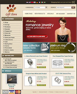
you can download .psd from sample template Free Template Jewelry,
please click here for download!!
Posted by
Andri Design
at
9:20 AM
![]()
![]()
Free Template E-commerce Shop Design
Labels: template 0 comments
you can download .psd from sample template e-commerce shop design,
please click here for download!!
Posted by
Muhammad Nurwegiono (41099007)
at
3:45 AM
![]()
![]()
Free template ecommerce web 2.0
Labels: template 0 comments
you can download .psd from sample template e-commerce web 2.0,
please click here for download!!
Posted by
Muhammad Nurwegiono (41099007)
at
1:19 PM
![]()
![]()
How to Make Photo Retro
Labels: tutorial photoshop 2 commentsThis here me will give You tutorial Make Photo Retro, How?
Follow step by step y....!!!
Step 1:
The first, make your workspace new with the way click at Your menubar File + New. Or only press at your keyboard CTRL + N. So, automically new frame opened.
Name : Make Photo Retro
Preset Sizes : 800 x 600
width : 800 pixel
height : 600 pixel
Resolution: 72 pixel/inch
Mode : RGB Color
Contents: White

So, automically workspace will opened with frame name Make Photo Retro.

Step 2:
Next, make new layers at your pallete with choose Layer + New + Layer, or only press your keyboard together with CTRL + SHIFT + N. Latter will out frame New layer for setting place. Change name layer1 with black, click ok. So, automically new layer has been created.
Name: Black
Color : None
Mode : Normal
Opacity : 100 %
So, automically new layers has been created at your pallete with layer name is black.
see, layers will like this.

Step 3:
set layer your black with color black, with choose at your toolbox Paint Bucket Tool that there buttom Gradient Tool or only press at your keyboard G. give layer black with color black at foreground color and set color black to layer black with only press your keyboard ALT + DEL. So, automically layer black will to be black.
like this.

Step 4:
get image that me gived for you. image with name Photo.gif and open photo.gif to your photoshop. Don't forget photo.gif still in format gif, so change format .gif to RGB Color. With choose at your menubar IMAGE + MODE + RGB Color. After that drag Photo.gif to workspace Make Photo Retro with press SHIFF your keyboard.
see, position image like this.

image will like this.

Step 5:
Choose at your toolbox Custom Shape Tool that there at buttom Rectangle Tool or only press your keyboard U. When you click Custom Shape Tool, see at your option bar, there name shape. Choose shape Flower 7, using scale or CTRL + T for zomm shape y.

see, image will like this..!!

Step 6:
here, I will make new layer 1 like Poster. With choose at your menubar
Filter + Artistic + Poster Edges. Smalling zoom to be 33% with click symbol -. Set value y.
Edge Thickness : 9
Edge Intensity : 4
Posterization : 2
After that click ok, so will like this.

set value y!

image like this..!!

Step 7:
Choose at your menubar Filter + Artistic + cotout. make zoom to be 33% with symbol -. set this value.
No. of Levels : 8
Edge Simplicity : 3
Edge Fidelity : 2
see this...!!

setting this value...!!

result will like this....!!

Finished and Good Luck for you...!!
Posted by
Muhammad Nurwegiono (41099007)
at
12:11 AM
![]()
![]()
How to Make Water Effect
Labels: tutorial photoshop 0 commentsHow to Make Water Effect?
This here me will give You tutorial Make Water Effect, How?
Follow step by step y....!!!
Step1.
Name : Make Water Effect
Preset Sizes : 350 x 350
Width : 350 pixel
Height : 350 pixel
Resolution : 72 pixel/inch
Mode : RGB Color
Contents : White, only ok. So will automically open workspace with name Make Water Effect, with have background white.
Step 2.
Press at your keyboard D, usually by default color black and white
Step 3.
Choose at your menubar Filter + Render + Clouds, so automically color will be change.
So,will Like this.

Step 4.
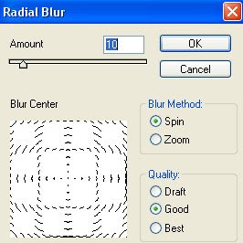
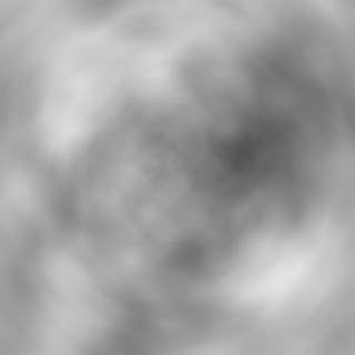
Choose at your menubar Filter + Blur + Radial Blur, so will out frame Radial Blur.
set value that me give for you.
Amount : 9
Blur method : Spin
Quality : Good
so, will like this
Step 5.
Choose at your menubar Filter + Blur + Gaussian Blur. So, will out frame Gaussian Blur. where the later place for setting value. set value that give me for you.
Radius : 2 pixel
Step 6.
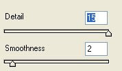
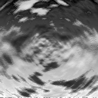
Choose at your menubar Filter + Skecth + Bas Relief. So, will out frame Bas Relief. Where the later place for setting value. set value that give me for you.
Detail : 15
Smoothness : 2
So, will happend change like this
Step 7.
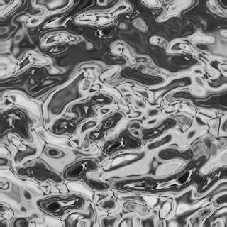
Choose at your menubar Filter + Sketch + Chrome. So will our frame Chrome. Where the later place for setting value. set value get give me for you.
Detail : 4
Smoothness: 5, and just klick ok.
So, will be like this
Step 8.
Choose at your menubar Image + Adjustments + Channel Mixer. So, will out frame Channel Mixer. Where the later place for setting value. set value get give me for you.
Red: -32
Green: 210
Blue: -145
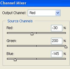
so, will be like this..!!
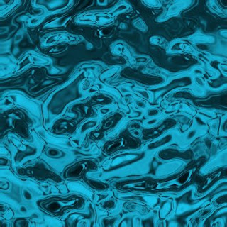
Step 9.
Choose at your menubar Image + Adjustment + Hue/Saturation. So, will out frame Hue/Saturation. Where the later place for setting value. set value get give me for you.
Hue : 11
Saturation : 27.
Lightness : -9
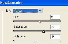
so, automically will like this the result.
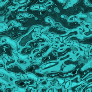
Finished and good luck try this tutorial Make Water Effect
Posted by
Muhammad Nurwegiono (41099007)
at
11:49 AM
![]()
![]()
Free Design Template Web 2.O
Labels: template 0 commentsWeb 2.0 is a term describing a trend in the use of World Wide Web technology and web design that aims to enhance creativity, information sharing, and, most notably, collaboration among users. These concepts have led to the development and evolution of web-based communities and hosted services, such as social-networking sites, wikis, blogs, and folksonomies.
and now Web 2.0 to be inspiration for designer in make template, logo, banner and many more...!!
you can download .psd from sample tempplate software developer!!
click here!!
download
Posted by
Muhammad Nurwegiono (41099007)
at
9:22 AM
![]()
![]()
Guide Your to Designing InDesign a Templates
Labels: article design 0 commentsGabriel Powell walks through each step in the InDesign template design process, helping you to forge a path toward the successful completion of any template.
Once you understand the concept of InDesign templates and the principles of their design, it’s time to learn the steps involved in designing a template. For your template to be successful, it must follow a clear path of development. Although this process can be rigorous, the payoff is well worth the time and effort.
Much like designing anything else, designing a template is a process:
1. Establish the project’s objectives.
2. Develop a preliminary mockup layout.
3. Construct the actual template.
4. Thoroughly test to ensure that everything functions as anticipated.
5. Implement the template into a live production workflow.
Let’s look at the steps in more detail.
Step 1: Define Your Objectives
They key to successful template design is starting with a clearly defined set of objectives. Before constructing any template, you must step back and gather as much information as possible that will influence the choices made during the template’s construction. After you’ve outlined the project’s objectives, the template can be constructed optimally to serve its intended purpose, and the subsequent phases in the design process should run smoothly. Even just a few hours of planning can save weeks of development time.
Three essential requirements need to be taken into consideration:
1. Design requirements
2. Workflow requirements
3. Printing requirements
Design Requirements
You need to understand intimately the design of the publication for which you’re constructing a template. If the design is still a work in progress, it’s better to wait until it has been approved before constructing the template, or you’ll waste valuable time and effort. The more specific the definition of the design, the more directed your efforts can be at designing a complete template.
When gathering design requirements, start with the obvious. Look at the overall page format and determine its dimensions, orientation, and arrangement (single page or spreads). Notice how the margins and columns are set up across different layout variations. Then move on to identify the textual content and ascertain the formatting applied to each element, including the typeface, size, leading, color, word spacing, and so on. Identify all the graphical content, including illustrations, images, charts, and tables. Determine the formatting applied to each one and establish rules for cropping, scaling, and positioning. If the publication contains advertisements, note all the possible sizes and arrangements.
Look for other special design requirements to be considered. Does the publication call for a table of contents or index? Is the publication printed in multiple languages? If so, what elements of the design change from one language version to the next?
Identify any other information that influences or limits your layout choices. Must the template be flexible enough to allow for different design options? Or should the template impose more structure?
Overall, you need to gain a sense of what’s required to produce each element in the publication. Each publication is unique, so be sure to account for everything.
Workflow Requirements
Anything that affects the sequence of assembly is a workflow requirement. Gather any special requirements that have an effect on the way the template is constructed. Although it’s impossible to predict every situation, here’s a list of some common factors to consider:
1.In what order will the various design elements be produced? The answer to this question helps you organize the template effectively, making it easier to produce the publication for which the template is designed. For example, by knowing the order in which stylesheets will be applied, you can optimize their organization by placing frequently used styles toward the top of the list and collecting them into style groups. The same goes for setting up master pages, object libraries, and color swatches. Name and organize them in a way that makes them easier to locate as you need them.
2.Are multiple designers producing the publication? If so, you might need to break up the publication into separate InDesign documents and create a book file to collect the documents together and keep the page numbers, stylesheets, swatches, master pages, and other items in sync. It’s also necessary to create a book file when producing long documents, such as books and catalogs.
3.Are other designers using an older version of InDesign? If so, you’re restricted by the tools you use, since you’ll need to utilize tools that are compatible with the older version. Tools such as InDesign CS3’s new transparency effects, table and cell styles, frame fitting options, and text variables are not compatible with InDesign CS2.
4.Must some elements be produced with Photoshop or Illustrator? If so, consider the use of native file formats, which have many benefits that other file formats don’t offer. All the layer information is preserved, so you can control the visibility of individual layers within InDesign. Transparency is preserved, so you can import a graphic without first having to flatten it. It’s also easier to edit a graphic and quickly update the modified link.
5.Does the publication utilize transparency effects? If the publication uses drop shadows, gradient feathers, or other transparency effects, you’ll need to be aware of the effect(s) when constructing the template, to make sure that the final document will be flattened properly when printing. For example, because type can interact with transparent objects in unexpected ways, it’s common practice to create an extra layer for textual elements, located above all the layers containing transparent objects and effects.
6.Is the publication printed in multiple languages? When a document uses more than one language, you might set up different paragraph and character styles with language-specific settings and the appropriate language dictionary for each language. Also, consider using layers to separate the different language content, which facilitates production and printing.
7.Will the publication be automated with Data Merge, XML, or another technology? Templates that employ an automated solution have special setup requirements. It’s important to know well in advance whether your publication will be automated.
8.Will the final content be repurposed for use in another form, such as on a web site or mobile device? If so, consider using InDesign’s XML tools in your template solution. Or if you plan to export the final content directly to an XHTML document, you’ll need to set up the template carefully to ensure optimal export results.
Printing Requirements
A publication’s printing requirements have a big effect on the decisions made during the template construction process. Knowing this information ahead of time allows you to significantly minimize or totally eliminate possible printing problems down the road. Talk with your print service provider about anything on which you need clarification. To get started, take the following common requirements into account:
1.Color. Does the publication call for spot colors, process colors, or both? Don’t use spot colors in the template if the publication doesn’t use them. Although this seems obvious, you’ll be surprised how often a spot color sneaks its way into a document.
If the publication is intended for RGB output only, such as a PDF download from a web site, create RGB swatches and remove CMYK swatches from the Swatches panel. It’s also a good idea to specify the Document RGB color space in the template so that colors of transparent objects are properly blended. Choose Edit > Transparency Blend Space > Document RGB.
If the publication will be printed in grayscale, your job is even easier. Just make sure that any images and graphics you’ll be importing are in grayscale format so the printing process can be accelerated.
2.Color management. Will the template be used in a specific color-managed workflow? If so, make sure that the template’s color management settings are configured properly.
3.Fonts. Determine which fonts the publication uses. Make sure that there are no problems with the font files, such as incomplete PostScript fonts or protected fonts, which have license restrictions and cannot be embedded in PDF or EPS files. Also, make sure that the fonts are properly licensed, installed, and activated.
4.Bleed. Do images print to the edge of the page? If so, you’ll need to specify the appropriate bleed settings in your template.
4.Resolution. Consider the medium of final distribution, and determine the appropriate resolution for all the images that will be imported. Commercial printing requires a resolution within the range of 150 ppi to 300 ppi, depending on the press and screen frequency being used. Desktop printing requires a resolution within the range of 72 ppi to 150 ppi.
Posted by
Muhammad Nurwegiono (41099007)
at
2:09 AM
![]()
![]()
Adventures Of Using Photoshop
Labels: article photoshop 1 commentsIf you don't have Adobe Photoshop, most other comprehensive graphics suites will do (ie. PaintShop Pro). Sorry folks, MS Paint doesn't cut it...
Note: I'll be using Photoshop CS, but older versions of Photoshop are just fine.
The first thing we need is a canvas on which you'll create your masterpiece. Click File -> New (shortcut: ctrl+n). You can ignore most of the settings save for the width, height and background fields. Enter 400 for width and height and ensure that "transparent" is selected as your background. Click "OK" and you're ready to begin.
Don't Panic: You will see a checkerboard pattern on your canvas. This is Photoshop's way of showing transparency.
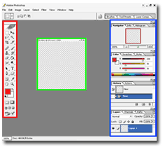
The area highlighted in red is the tool bar. I will go through each tool in detail in subsequent tutorials.
The area in green is your canvas. This is where your graphics will be created.
The area highlighted in blue are the Palette windows. These are the keys to unlocking some of Photoshop's most powerful and innovative features.
I encourage you to play around with the various tools just to get your feet wet. Accidental discovery is a great way to learn the intricacies of Photoshop. See you next month!
Posted by
Muhammad Nurwegiono (41099007)
at
1:58 AM
![]()
![]()


